instagram

How I Edit in Adobe Lightroom!

Hi friends!

I've had a lot of people ask me how I edit all of my Instagram photos. Well, just like the thousands of other IG-savvy folks out there, I edit using a consistent 'style' and color scheme to keep my grid clean. There are TONS of free apps and programs available to accomplish this, meaning that you don't need to spend tons of money on software and cameras to get a good grid. Use what you have, work hard, and make something great!

Screen Shot 2018-07-31 at 9.54.09 PM.png

This brings me to the point of this blog: how I edit my photos in Adobe Lightroom! Now as I mentioned earlier, there are countless editing apps out there, with the mobile version of Lightroom being one of them.

I will do this tutorial using the mobile app because it has almost every feature that desktop Lightroom does. You can even sync photos between the two for copying edits! I use this feature a TON when traveling because it allows me to edit my images without carrying around a laptop and hard drive.

Now, without further ado, let's EDIT!

STEP 1: ADJUSTING LIGHT

This the first section of Lightroom that I adjust when editing images. As with all edits, what you do in this section depends on what ‘look’ you aim to achieve. I like my images to be bright and so here’s what I adjust:

Exposure: This setting changes how exposed/bright the image is. Depending on how bright the original one is, I typically bump this to +1 or +.75.

Contrast: This setting changes how different the darks and lights in an image look. I don’t like my images super contrasted because it takes away from the bright, cheery look, so I hover in the 5-20 range for this edit.  

Highlights: If you want to achieve a bright image, bringing up highlights is super key. Lower highlights help under-expose certain areas in an image. For example, if you want to see the clouds in the sky (which is typically too bright in images). 

Shadows: This adjustment, when raised, decreases shadows in an image. How much I raise it depends on the image, but typically I raise it enough to where little shadows exist.

Whites: As the name implies, whites bring up the whites in an image. I like the whiter appearance, so I usually bring them up to +20 or so.

Blacks: When raised, this decreases the blacks in an image. I typically don’t change this, but when I do, usually only go up to +10.  

STEP 2: ADJUSTING COLOR

The color section of Lightroom is really where theme creation begins. Think about it: when you look at any creator’s grid, what’s the main thing that looks similar? Color.

It starts with actually taking photos that include your desired colors in it (because software can’t do everything). For instance, having colorful photos for a colorful grid, darker tones for a dark grid, and so on. Lightroom comes in by helping to fine tune colors, and also diminishing unwanted ones.  

White Balance: This section changes the warmth/coolness of an image, how it is tinted, and also vibrance/saturation. For a colorful theme, I like to have a warm accent and pink tint. This means sliding the first bar to the right for however warm you want it to be, and again to the right on the second bar for the pink tint. You also want to bump up the saturation and vibrance, which changes how noticeable and rich the colors are. I aim for +15-30 in saturation and +10-20 in vibrance. 

Color Mix: Located at the top right of the Lightroom app, this is a tool that really builds theme. For each of the main colors (red, orange, yellow, purple, green, teal, etc), there are options to change the hue, saturation and luminance. If you’re aiming for a colorful feed, then it works well to boost brighter colors and desaturate darker ones. You can also change color hues to keep consistent shades throughout all photos. I love using this tool for my skin, helping to diminish red undertones from acne *I cry*. 

 STEP 3: EXTRA EFFECTS

After I finish editing color, my last steps are to do some minor effects based on the photo. But before doing this, there is one effect I use that ties into color: 

Split Toning:  Hidden under the “Effects” panel, split toning allows you to choose a color shade for shadows and highlights. This adjustment is my new favorite for color edits, and it’s honestly much easier than adjusting multiple colors. 

Clarity and Dehaze: Wile I don’t use these too often, clarify and dehaze are sometimes useful when the sun or other phenomena cause a bright image to look hazy and unclear.

 Sharpening and Noise Reduction: Located under the “Detail” tab, these edits do wonders in the appearance of a photo. Images that are out-of-focus or unclear can be fixed by raising the sharpening tool—just beware of too much image grain! But just as sharpening adds noise/grain, noise reduction takes it away. This is particularly useful if you shoot with a high camera ISO or at night.

STEP 4: PRESETS!

While optional, this final step allows you to save all of your edits into a preset that can easily be applied to future images in one tap. You do this by tapping the three dots in the upper right of the app screen and selecting "Create Preset." From there you can name the preset and select which edits to include in it. 


I hope you found this tutorial helpful! Feel free to DM me any Lightroom edits of your own via my Instagram (account name bel0w). Remember to hit the subscribe button and never miss another #BeyondWords blog again!

Check back each week for a new blog on social media tips, life, food and more. Oh, and of course...

CONNECT WITH ME: 

Instagram: @maddiekjosa

Twitter: @Hey_ItsMaddie31

Snapchat: @Heyitsmaddie97

CONTACT ME!

~This is My Story~

5 Tips for Using Instagram Highlights!

My Post.jpg

There's a new ruler in the social media food-chain, and it's name is Instagram.

While just a fledgling platform years ago, this photo-sharing network has grown to unpredictable heights in 2018.  In fact, Instagram now amasses over 800 million active users a month. But what has stunted this growth?

The answer lies partly in the slew of innovative, engaging updates we all never expected but loved instantly. Here are some you might recall:

  • The ability to choose from different text styles in Instagram Stories
  • Being able to tag other accounts in your Instagram Bio
  • For some accounts, adding "swipe up" link features in Instagram Stories
  • The ability to follow hashtags 
  • The ability to turn on post notifications for certain accounts

Now, this app hasn't released everything we want (hint: having portrait mode as a Stories option). But one thing for certain is that Instagram knows what the people want. And it's most recent success?

Instagram Story Highlights.

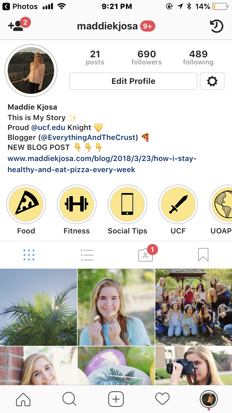
If you're new to the #InstaGame, here's the rundown: the Highlights feature allows users to save their stories to certain 'albums' (which can be named anything like food, workouts, makeup, etc) that will appear publicly and permanently on the user's Instagram profile.

For consumers, Highlights is an incredibly useful tool for sharing your lifestyle/personality and saving precious memories.

For businesses, it allows events, deals, products, and insider-looks to be easily seen and saved by an audience.

I see more and more each day people buying in to the features of Highlights. But, I also see that not everyone knows how to use it.

Whether you fall into that category, or are just looking to grow your social savvy, here are some tips to help you get even more out of this awesome feature:

1. Make. Cover. Photos. 

I honestly cannot stress this enough if you decide to seriously engage in Story Highlights. Creating cover photos with a consistent, simple, and creative look allows your profile to stand out to other users! Think of your Instagram profile as a resume to new followers: if they like what they see, they will want to see more (meaning following you!). 

There are a few things to consider when it comes to creating the actual covers. You always want to make sure that the icon you want to show in the cover is centered in the graphic. As for the graphic itself, design it in Instagram Story size (1080 x 1920 px). To create the graphics, you can utilize online programs like Canva and PicMonkey, or pricier-options like Adobe Illustrator or Photoshop for detailed edits.

Finally, make sure they all have a consistent color scheme and look. The covers should fit your Instagram theme (if you have one made!). 

2. Your Highlights Albums Should Describe You!

The other day I was looking at someone's profile and their many Highlights albums. After scrolling through for a few minutes, I noticed they had one called "Makeup." Pretty common. But the only issue? This person NEVER posts about makeup! And a few days later, that album was no longer in her profile.

This story teaches us one thing: make sure that your albums describe you! One way to figure this out is to conduct a Story Audit by accessing your Story Archive and seeing what content you post frequently. For example, I post a lot of food, fitness, UCF, Universal Studios, and social media stories; hence my Highlights album choices!

3. Add to Highlight Albums While Your Stories Are Still Viewable

All Instagram Stories expire 24 hours after they are posted. Once this happens, you can only add new stories to your highlight albums by opening each one and manually adding them from the Story Archive. I don't know about you, but this is honestly too much work for me! Instead, add to your albums before they expire. Here's how:

1. Open the story you want to add

2. Tap the Highlight button in the bottom right corner of the screen.

3. A Highlight pane will appear at the bottom of the screen. Simply tap the album you want to add it to, and VIOLA! You're done!

4. Do Not Add Old Stories to New Highlights Albums

Very simply: only add stories that are posted after your Highlights albums are created. This matters because users must tap through your entire album before they can see the newest story, and since it is a cover, the graphic you create should always be the first thing they see.

Adding stories that were posted before you created your Highlights album results in the cover image being sandwiched between stories. This looks unprofessional, unclean, and may lead to your beautiful cover never being seen when a user gets tired of tapping through the album. 

But how can you make sure a user sees everything in your album? This leads me to my final tip:

5. Keep Your Highlights Albums Short

Let's face it: we all have short attention spans. If it isn't quick or eye-catching, chances are we won't pay attention to it. That's why Twitter is such a popular social network. We get our daily doses of entertainment, news, and laughs in short, concise pieces. 

The same principle of short 'n' sweet applies to your Instagram Highlights. Nobody wants to tap through 30 stories of food that you eat, or any content for that matter. When it comes to Highlights, you want to keep your albums to 15 stories or less

Each week, I will poke through my own Highlights to refresh the content in them and trim it down to that limit. This practice allows current followers to see new content without having to re-tap through old stories, and new followers to quickly glimpse my feed and see who I am. 

Moral of this tip? Less truly is more!


I hope you enjoyed my latest blog post! Check back each week

for a new blog on social media tips, life, food and more. Oh, and of course...

join ME: 

Instagram: @maddielill

Twitter: @Hey_ItsMaddie31

Snapchat: @Heyitsmaddie97


EAT WITH ME:

Instagram Pizza Blog: @everythingandthecrust

Facebook: Everything and the Crust


CONTACT ME!


~This is My Story~